
Solving the Puzzle - How the New Christmas Cards Where Designed
- andrew wood

- Dec 12, 2025
- 7 min read
Updated: Dec 13, 2025
Introduction
Creativity, for me, resembles a complex form of problem-solving. Don't get me wrong I'm a romantic at heart. Meaning at the core of it there has to be a bit of magic (the idea). But that bit of magic is elusive and fragile, swaying in the wind, almost invisible and often at risk of being lost all together if not distilled with care.
To capture that bit of magic, you need to solve the puzzle and by that I mean figure out the practical way in which that ephemeral idea is going to take tangible form. How will all the different pieces of research (the things you love) fit together in a form people can access, be it a painting, a sculpture, a pencil case, or in this instance, a pack of Christmas cards? Your role as a creative individual is to weave together all those loved elements into a coherent and practical design that resonates with others.
It's not an easy process and I often forget how I've done it in the past! So, I've written this blog post to explore the process I went through to create the new set of Christmas cards whilst it's still fresh to me. Maybe it will be of interest/of help to you the reader or ( as I have to worst memory) just a reminder to me of how something I've made has come into being.
How the Christmas Cards Began
As with all my creative work the Christmas Cards evolved out of previous creative projects. In this case from a mixed pack of twelve greeting cards/notecards which had amongst them a robin and star design (see images 1 and 2). Around the Christmas period people began requesting to buy these two designs separately so I recognised the need to create a Christmas pack made up of them (see images 3 and 4). The new Christmas pack seemed popular, but since the designs weren't originally intended for the holiday season, I felt they required some adjustments, particularly in their colour palette. So I began redesigning them.


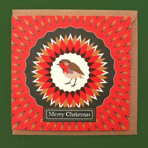
The Robin Christmas Card
The robin card is a good place to start. The previous pack of Christmas cards featured a silhouette of a robin set in the centre of a blue, white and orangey red radial pattern (see image 5). The robin has become a recurring theme in my design work, appearing on various products such as cards, wrapping paper, mugs, and on art prints.
The blue, white, and orange of the original design is a favourite colour combonation of mine, but the vibrant green and red colours used in a pattern for Christmas wrapping paper featuring the robin (see image 6) felt more festive. Therefore the initial plan involved bringing those colours back into the design, while also aiming for a sense of richness and indulgence in the new cards. Experimentation with a bronze element was undertaken across various versions, leading to the decision to use a bronze and white radial background (see images 7-10).
The robin has been depicted as both a more graphic silhouette form as well as a more detailed illustrated form (see image 11) in my previous design work. For this new design, I wanted to find a way to blend these two approaches keeping to a reasonably simple graphic form that would be in-keeping with the rest of the design and the other Christmas cards in the multipack whilst also retaining the charecter of the illustrated robin. I did this by simplifying the robin's depiction to just block colours and removing the pencil lines (see image 12).


At this stage, I decided to reintroduce the diamond shapes from the original Christmas card design, as the area around the central motif appeared somewhat plain (see image 13). Consideration also began towards how the design would appear once printed, since colours often change when transitioning from screen to ink on paper or card. Concerned that the bronze background might end up looking brown or beige when printed. A rich red background with bronze-coloured diamonds was chosen for the final design (see image 14-15). The outcome is precisely what I was aiming for successfully creating a super festive Christmas card with a harmonious balance between illustration and graphic design.


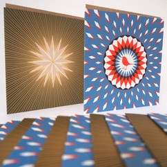
Star Christmas Card
The second card from last year's multipack featured a star design, a motif that similarly to the robin frequently appears across Bright Stem products and artwork. The light colours used for the star, when placed against the earthy green background, create a beautiful glowing effect which I loved (see image 16). However Injecting some festive colour and warmth into the design became a priority.
At first, experimentation involved changing the star and the surrounding shapes into a multitude of colours, leading to mixed results (see image 17,18). I wanted to capture that feeling around Christmas when everyone's houses are glowing with lights and decorations whilst the outside world is often dark, wild, wet and windy. However, it became clear that the coloured star was not achieving this effect. Recalling that the same star design had been used for wrapping paper in a warm yellow colour on a creamy white background (see image 19). This yellow would be perfect for the star of the Christmas card, giving a warm centre to the design while the diamond shapes around it could remain multicoloured but now on a black background (see image 20).


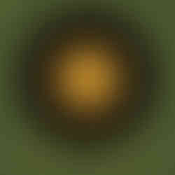

I started to imagine the star and colours around it like a reversed snow globe (see image 21). So instead of looking in on a winter wonderland you'd be looking in on a warm colourful space. With the multicoloured diamonds jumping out from the star reminiscent of multicoloured vintage Christmas lights. Whilst the outside of the design would evoke the earthy greens and browns of the winter landscape. So the yellow star and multicoloured diamonds where placed inside a black circle. With the background split in two. The top half being a light brown amberish colour and the bottom a dark green. Then both of those colours overlayed with yellow streaks emitting from the centre as if the inner globe is glowing with light. I'm so pleased with this design. The imagery conjures up that winter festive hygge glow, enveloping the viewer in a sense of warmth and celebration.


Abstract Geometric Christmas Card
Unlike the other two designs the final Christmas card wasn't part of the previous pack. Inspiration for this instead evolved out of a pattern created for wrapping paper. Which was made up out of a mixture multicoloured geometric shapes and forms some inspired by my sculptures others christmas baubles and lanterns. All of which were placed on a black background.
For the new Christmas card, shapes and forms were arranged pointing outward from the center, inspired by folk art and tile patterns (see image 25, 26). The designs and experiments looked great as patterns, but they didn't feel quite festive enough. Recalling an Easter card designed earlier in the year, particularly how the text was arranged in two semi-circles at the center of the card (see image 27). I began illustrating a similar design but with 'Merry Christmas' text in the semi circles. This approach started to evoke a more Christmas-like feel rather than resembling a tile pattern. However, something still felt off, though it wasn't immediately clear what it was. As is often the case, the design was set aside for a few days, leading to a sudden recollection of the wildflower seeds!


Whilst gardening earlier in the year, specifically scattering wildflower seeds. I found myself mesmerised by the unique shapes and forms of the seeds nestled in my hand (see image 29). Recalling the beauty of these small, intricate forms jumbled together. A thought sturd in my mind what would it look like if all the geometric forms on the design where jumbled up instead of just pointing towards the centre. The background colour also needed to change. The black background made me think of the shapes as little lights or lantons but now in my head they were seeds. A creamy white background colour seemed right reminding me of a ceramic dish you might use for baking. After that everything fell into place. As a final touch I added some diamond green shapes that brought to mind sweets and some Christmas crackers and it was complete (see images 30, 31).


There was something in the design that simply said Christmas to me. Whether it's that the jumbled nature of the design reminds me of all the presents and wrapping paper scattered across the floor in the frenzy to open them, the tin of sweets poured onto the table for everyone to pick their favorites, or all the ingredients in the kitchen waiting to go into the cake... There's something about the chaos and order of the design with those colour combinations and small intricate shapes that just says to me Christmas! I loved this design so much that it was also turned into wrapping paper and tags (see images 43, 44 and 45).


Conclusion
So to conclude, although I had this idea (bit of magic) in my mind, it was not easy or straightforward to translate that into a set of three Christmas Cards. As I mentioned at the beginning, it was like a puzzle because like trying to solve any good puzzle you will almost certainly have those moments of frustration where all the parts won’t fit together. But given enough time, those moments can often be the point where a creative project can turn from something that is okay into something you really love.


Those are the moments where everything gets turned upside down and inside out. Where the problems you face have to be solved piece by piece, carefully trying different approaches. Taking time, letting your mind wander about, remembering moments like scattering seeds, or imagining warm glowing reversed snow globes..., or experimenting with combining illustration and graphic design techniques. A lot of the time it can just involve going back over old design work to find new clues as to how to proceed. There is never one simple answer as to how creativity evolves. But from my perspective it takes time care and a weird combination of single mindedness (to get the job done) and open mindedness (to explore all avenues possible).

Why does this all matter? Maybe it doesn't, they are after all just Christmas cards! But with all the current discussion around what AI can and cannot do, it seems logical to spend some time examine what we, as humans do do to create.... even if it is just a set of card designs. With that in mind, I will continue this blog post with a second one that focuses on the packaging design for these Christmas cards, where I use Kandinsky's approach to abstract painting to combine these three designs into a new folder design.


Comments